Nuvola Skin
From ThePlaz.com
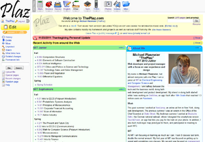
I created a new skin for my website, the "Nuvola" skin for MediaWiki. I created a new skin to give my site a improve usability, unique look, and to improve my CSS and design skills.
The Nuvola icons are based on the Nuvola icon set for KDE 3 by David Vignoni
The Mediawiki skin design is based on the MediaWiki homepage design draft I adopted for my homepage. This design came from the "Monobook" skin, which is the old MediaWiki default skin. (I created this before the new MediaWiki default skin, "Vector" was released.) I kept the content area and layout, but I wanted to create a new skin because all of the MediaWiki skins suck. With Wordpress, everyone installs a new skin, and every site looks unique. With MediaWiki, almost no one uses a new skin.
I had originally started it in the summer of 2006 (less than a year after I had gotten my website.) I did not get much done in 2006, except some new file icons and a start to the CSS. I did do a full design on paper, which unfortunately I can not find anymore. In summer 2009, I decided to finish the skin.
This skin has 3 main elements: far better drop downs, a new sidebar, and a new footer.
Contents |
Drop Downs
The drop downs for MediaWiki were the first things I ever really coded with CSS. They were ugly and never really fit in with the site design. In addition, they did not work well in all browsers (although I can not conclusively determine that the new ones work better or if the browser manufactures changed their code). Also in the Mediawiki:Sitenotice drop downs, the HTML code appeared before the content. On a text based browser, a visitor had to scroll though the drop down menus every time, and it was not an ideal design for search engines. The new skin puts the drop downs at the bottom of the HTML code and the CSS makes it display at the top. The drop downs also have icons and are spaced much nicer.
The drop downs are now hard coded to speed up the site. The old ones were dynamically created as the "sitenotice", and I think I could do that again except for IE8 which requires strict nesting adherence that MediaWiki did not do for me.
Sidebar
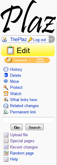
Because I removed the old personal area and page tabs, a lot more items needed to go in the sidebar. The challenge was to differentiate between the items to make them easy to scan. I dropped some duplicate items, such as the link to the Main Page because people know to click on the logo to go home. On browsers which support CSS print stylesheets (aka Not IE6), there is no print view icon. I want people to break out of the habit of looking for the print view button. I originally planned to put a notice saying "just hit print," but I decided against it.
I did not think that the old site bar made it easy for people to start editing. That is why I made the edit button big and yellow.
I also worked with commenting to make it easier to let people make a comment. The "comment" link is the same as clicking the comments tab and then clicking on the "+" tab. I still have a "View comments" link to go to the comments page. The links change colors depending on if they are active; "comment" lights up if a user is logged in (because must be logged in to edit), and "view comments" only lights up if there are comments.
I did not like the current split between navigation and toolbox; it seemed like some items should be in the other one and items were mixed between page specific (ie related changes) and site specific (ie special pages). Instead, I combined all of the links relating to the current page on top, and put the links to other pages on the site under the search bar (using the search bar as a divider).
I hid the rest of the personal links in a drop down. Modern browsers support hiding links under drop downs so skin authors can now be unafraid to use this technique. I think that MediaWiki should put it's best foot forward with a skin that uses "tricks" like drop downs. If a user insists on running in a reduced mode, than that user can switch themes (or a user agent sniffer could - for instance IE < 6).
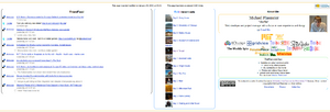
I made the footer all about me. Most of my visitors arrive from Google, so I want them to find out a bit about me and some of my projects. I used to have a flickr widget and the MIT badge integrated in the sidebar, but that made the sidebar a mess of navigation and about me. In addition, I wanted to highlight my friendfeed. I had originally used the friendfeed widget code in my April 2009 homepage minor-redesign. I use their widget code, but apply my custom CSS rules on top of it to style it so that it is more compact. In the center column, I have my most recent 10 flickr sets. The flickr JS widget I was using before showed 3 random photos from my photostream. I organize using sets on flickr, so I wanted to highlight them. I wrote some PHP backend code which called the flickr API. It was surprisingly easy to do since the flickr API is so beautiful! In the third column, I added some lines about me and all of my site logos, which used to be in the header and sidebar. I really like the way the copyright statement turned out.
The 3 columns are fluid-width. It was a challenge to be able to maximize the space among all window-widths and it required a lot of fine tuning.
Extra Non-Skin Items
Google Search
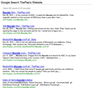
I made some hacks to the internal pages for my site which makes it easier to use. They are not part of a skin per say. For search results, I display Google Custom Search results below MW search results in an iframe. I was able to "hack" the Google results so that it would search the query the user had entered. This is handy because the MW search is not the best and Google might have some results. It also allowed me to remove the separate Google box I had before.
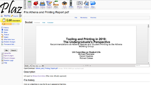
Scribd iPaper
For documents, I have used the Scribd iPaper plug in JS to automatically display documents in the browser using Flash. This is a big usability boost because the document is immediately visible. Most users are looking to read, not edit the document. This presents the document quickly. A user does not need to hunt for a tiny download link. Plus, of course, it helps users who do not have Microsoft Word.
This was actually fairly easy to do using the Scribd API.
Current Status and Known Issues
The code is a bit of a hack and is only tested on my rules (ie must be logged in to edit). In addition, I keep finding and fixing stuff. Lastly, I am OK with this rendering a bit different in different browsers. I use the -moz-rounded-corners to have rounded corners in Firefox. Corners display square in other browsers. You may not be OK with this.
Plus, 4 level drop downs, the unprotect link, the ajax "watch" link, and the above mentioned Scribd mod are all broken, but should be fairly easy to fix when I get some time.
Raw Source
- http://wiki.theplaz.com/w/skins/nuvola/main.css?207
- http://wiki.theplaz.com/w/skins/common/commonPrint.css?207
- You can see the rest with your favorite webpage deconstruction tool: Web Developer Toolbar, Firebug, etc
Optimization
I used YSlow to do front-end optimization. I combined most of the images into 2 "sprites". It was the first time I ever used that technique. I minified and combined CSS and JS pages. I think that MediaWiki should have that feature since it would speed things up. I also played with HTML headings, expires, and e-tags to maximize caching. Right now, only the page and the Google Analytics code will load when you switch pages. I still have some back-end work to do, so the site is not as speedy as I would like.
In progress
An in progress version of the Nuvola skin: File:Fitt's Law - Beta 1246387717568.png
