Difference between revisions of "Baker House Sign Project"
From ThePlaz.com
(post more info) |
(→Other Signs: make heading for flickr link) |
||
| Line 27: | Line 27: | ||
[[File:Signs Mockup Page 6.png|200px]] | [[File:Signs Mockup Page 6.png|200px]] | ||
[[File:Signs Mockup Page 9.png|200px]] | [[File:Signs Mockup Page 9.png|200px]] | ||
| + | |||
| + | ==Installation photos== | ||
For more photos, see: http://www.flickr.com/photos/theplaz/sets/72157623442461422/ | For more photos, see: http://www.flickr.com/photos/theplaz/sets/72157623442461422/ | ||
Revision as of 14:19, 17 July 2010
In Spring 2010, during my freshman year at MIT, I replaced the signs around Baker House, in my role as VPFS.
Contents |
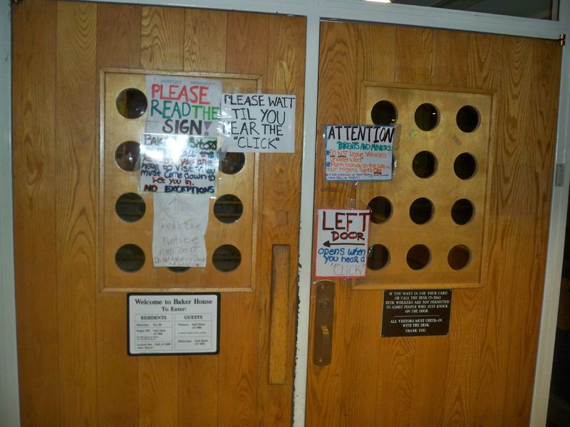
Old Front Door
This is the inside front door of MIT's Baker House, a dorm. Some signs are professional made, others are homemade with varying degrees of care. People make mistakes with it every time because they do not read all of the signs. Visitors just pull on the door, because they don't know that it is locked.
- There is a sign that says "Please Read the Sign!". And it's marked as "IMPORTANT". Twice.
- There is another sign that says: "Read the notice AND DO IT"
- Multiple signs tell people not to knock on the window. No one listens to that. Everyone knocks on the window. And every desk worker lets them in. Useless.
- There is somewhat conflicting information as to what to do with your vehicle. Can you park it on the curb real quick or must you always be there with it?
- There is conflicting information as to what visitors should do. (At least they know not to knock on the window) Can they call the desk worker, or must they call the resident they are trying to visit to let them in? Do they have to sign in after that?
- There is a nicely designed professional sign in the bottom. Too bad no one reads it.
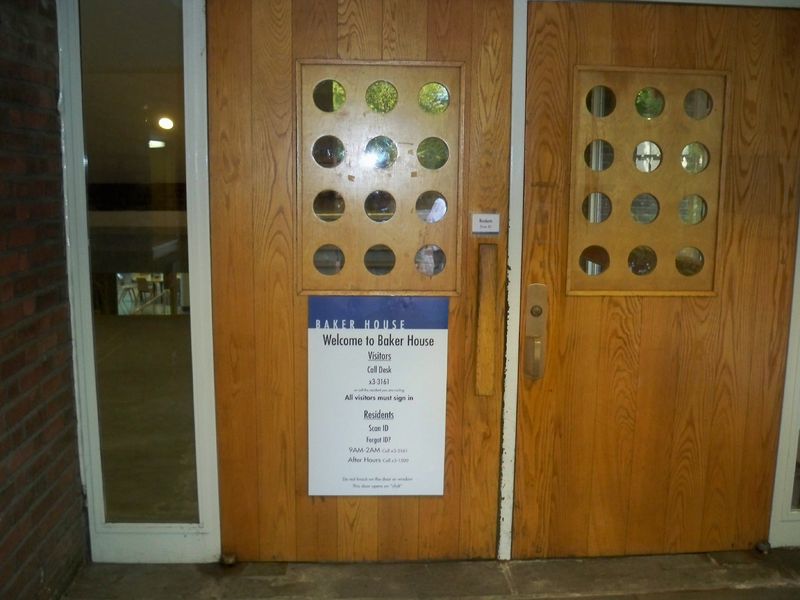
New Front Door
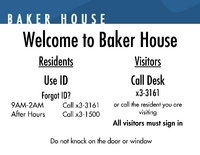
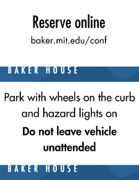
This is the new, revised Baker House front door. There is only one sign. The sign combines all of the information which was on the other signs in a manner consistent with the rest of Baker House branding. The sign was originally made to fit in the window area, whoever this led to problems because people could not see through the window. It works just as well on the bottom.
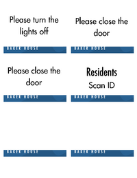
The little "Residents Scan Id" sign is a subtle notice to NON-residents that the door is locked as the go to pull on it.
Other Signs
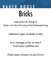
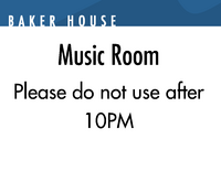
I also revised the other signs around Baker. The signs match the branding of Baker House developed for the Baker Website by Trevor Filter. Some signs I replaced, while other signs are new. The new signs hopefully address issues that I observed at Baker. The signs together will help reinforce Baker's image as the #1 dorm on campus.
Installation photos
For more photos, see: http://www.flickr.com/photos/theplaz/sets/72157623442461422/
