Difference between revisions of "Touch&Travel"
From ThePlaz.com
(add page) |
(add more about what is) |
||
| Line 4: | Line 4: | ||
[[File:TouchandTravel App Icon.png]] | [[File:TouchandTravel App Icon.png]] | ||
| + | ==What is Touch&Travel?== | ||
| + | Touch&Travel is a program by Deutsche Bahn to let people pay for the train using their cell phones. A user could "check in" at their departure station, travel on Deutsche Bahn and partner systems, "check out" at their destination, and then receive a monthly bill with their travel costs automatically calculated. Before I joined, the program was a 3-year pilot using [[NFC]] technology. However, at the time NFC technology was only available on Nokia "feature" flip phones. | ||
| + | |||
| + | ==My work== | ||
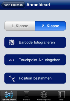
| + | I re-imagined Touch&Travel to work with smartphones. I started by designing the UI. I made a pie-in-the-sky version and a more realistic version. I also designed how the app could work securely without NFC. The app can use either geolocation, 3D barcodes, or a simple stop number to allow users to check in. This is then validated with network-based location services from the carrier (with user permission, of course!). | ||
| + | |||
| + | ==Release== | ||
On January 6, 2011, right on schedule, Deutsche Bahn released the beta of the Touch&Travel iPhone application. The architecture of how the application fit into their existing system was right how I had designed it over the summer. They made some tweaks to the UI, but ~80% of the UI was as I had designed it. Some of the artwork I prepared over the summer even made it into the application. | On January 6, 2011, right on schedule, Deutsche Bahn released the beta of the Touch&Travel iPhone application. The architecture of how the application fit into their existing system was right how I had designed it over the summer. They made some tweaks to the UI, but ~80% of the UI was as I had designed it. Some of the artwork I prepared over the summer even made it into the application. | ||
In particular I am happy that they took my icons for the check in methods. It would be so cool if those icons would be printed in stations and/or added to their style manual. Germany corporations, including Deutsche Bahn, are some of the great patrons of modern typography and modernist design. I would be honored if my work was a part of that. | In particular I am happy that they took my icons for the check in methods. It would be so cool if those icons would be printed in stations and/or added to their style manual. Germany corporations, including Deutsche Bahn, are some of the great patrons of modern typography and modernist design. I would be honored if my work was a part of that. | ||
| − | *[[:File:TouchandTravel iPhone Guide.pdf|FAQ Guide (German)]] | + | *[[:File:TouchandTravel iPhone Guide.pdf|FAQ Guide (German) but has the screenshots]] |
| + | *[[:File:Bedienungsanleitung 20111101.pdf|New FAQ Guide (Still German)]] | ||
| + | |||
| + | ==Current Status== | ||
| + | As of January 2012, the project is still in piolt. | ||
===News Stories=== | ===News Stories=== | ||
Revision as of 04:42, 30 January 2012
Touch&Travel was a program at Deutsche Bahn I was involved with when I worked there
Contents |
What is Touch&Travel?
Touch&Travel is a program by Deutsche Bahn to let people pay for the train using their cell phones. A user could "check in" at their departure station, travel on Deutsche Bahn and partner systems, "check out" at their destination, and then receive a monthly bill with their travel costs automatically calculated. Before I joined, the program was a 3-year pilot using NFC technology. However, at the time NFC technology was only available on Nokia "feature" flip phones.
My work
I re-imagined Touch&Travel to work with smartphones. I started by designing the UI. I made a pie-in-the-sky version and a more realistic version. I also designed how the app could work securely without NFC. The app can use either geolocation, 3D barcodes, or a simple stop number to allow users to check in. This is then validated with network-based location services from the carrier (with user permission, of course!).
Release
On January 6, 2011, right on schedule, Deutsche Bahn released the beta of the Touch&Travel iPhone application. The architecture of how the application fit into their existing system was right how I had designed it over the summer. They made some tweaks to the UI, but ~80% of the UI was as I had designed it. Some of the artwork I prepared over the summer even made it into the application.
In particular I am happy that they took my icons for the check in methods. It would be so cool if those icons would be printed in stations and/or added to their style manual. Germany corporations, including Deutsche Bahn, are some of the great patrons of modern typography and modernist design. I would be honored if my work was a part of that.
Current Status
As of January 2012, the project is still in piolt.
News Stories
All of the news stories are in German, unfortunately
- Press Release (German)
- AreaMobile: Touch&Travel: Bahn veröffentlicht Fahrkarten-App für das iPhone
- Computer Bild: Touch&Travel: Bahn veröffentlicht Fahrkarten-App
- TripsByTips Reise-News: Deutsche Bahn führt elektronisches Ticket "Touch&Travel" für das iPhone ein
- iFUN.de/iPhone: E-Ticketing: Touch&Travel-App der Bahn jetzt verfügbar
- Macnotes.de: Touch& Travel iPhone-App: Bahn-Projekt um Barcode- und GPS-Standorterkennung
- KUKKSI Nachrichten: 10:02 | Deutsche Bahn: Erste Fahrkarten-App veröffentlicht
- HANDY-TESTS.net: Handyticket kommt: Morgen soll das e-Ticket der Bahn eingeführt warden
- Eisenbahnjournal Zughalt.de: Touch&Travel nun auch mit iPhone nutzbar


