Visual Clutter
From ThePlaz.com
This is such a bad example of visual clutter.
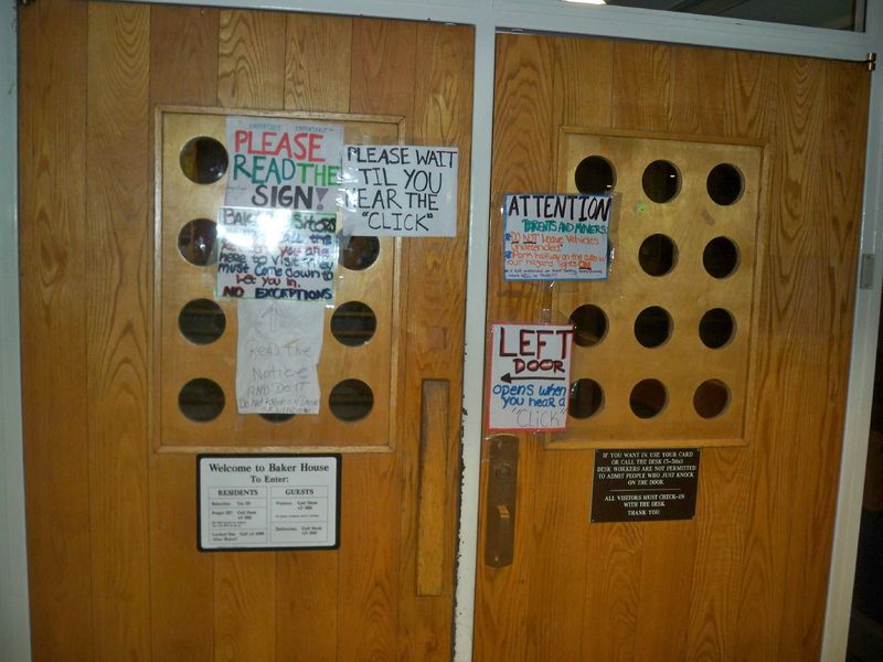
Baker House Door
This is the inside front door of MIT's Baker House, a dorm. Some signs are professional made, others are homemade with varying degrees of care. People make mistakes with it every time because they do not read all of the signs. Visitors just pull on the door, because they don't know that it is locked.
- There is a sign that says "Please Read the Sign!". And it's marked as "IMPORTANT". Twice.
- There is another sign that says: "Read the notice AND DO IT"
- Multiple signs tell people not to knock on the window. No one listens to that. Everyone knocks on the window. And every desk worker lets them in. Useless.
- There is somewhat conflicting information as to what to do with your vehicle. Can you park it on the curb real quick or must you always be there with it?
- There is conflicting information as to what visitors should do. (At least they know not to knock on the window) Can they call the desk worker, or must they call the resident they are trying to visit to let them in? Do they have to sign in after that?
- There is a nicely designed professional sign in the bottom. Too bad no one reads it.
For more photos, see: http://www.flickr.com/photos/theplaz/sets/72157623442461422/


